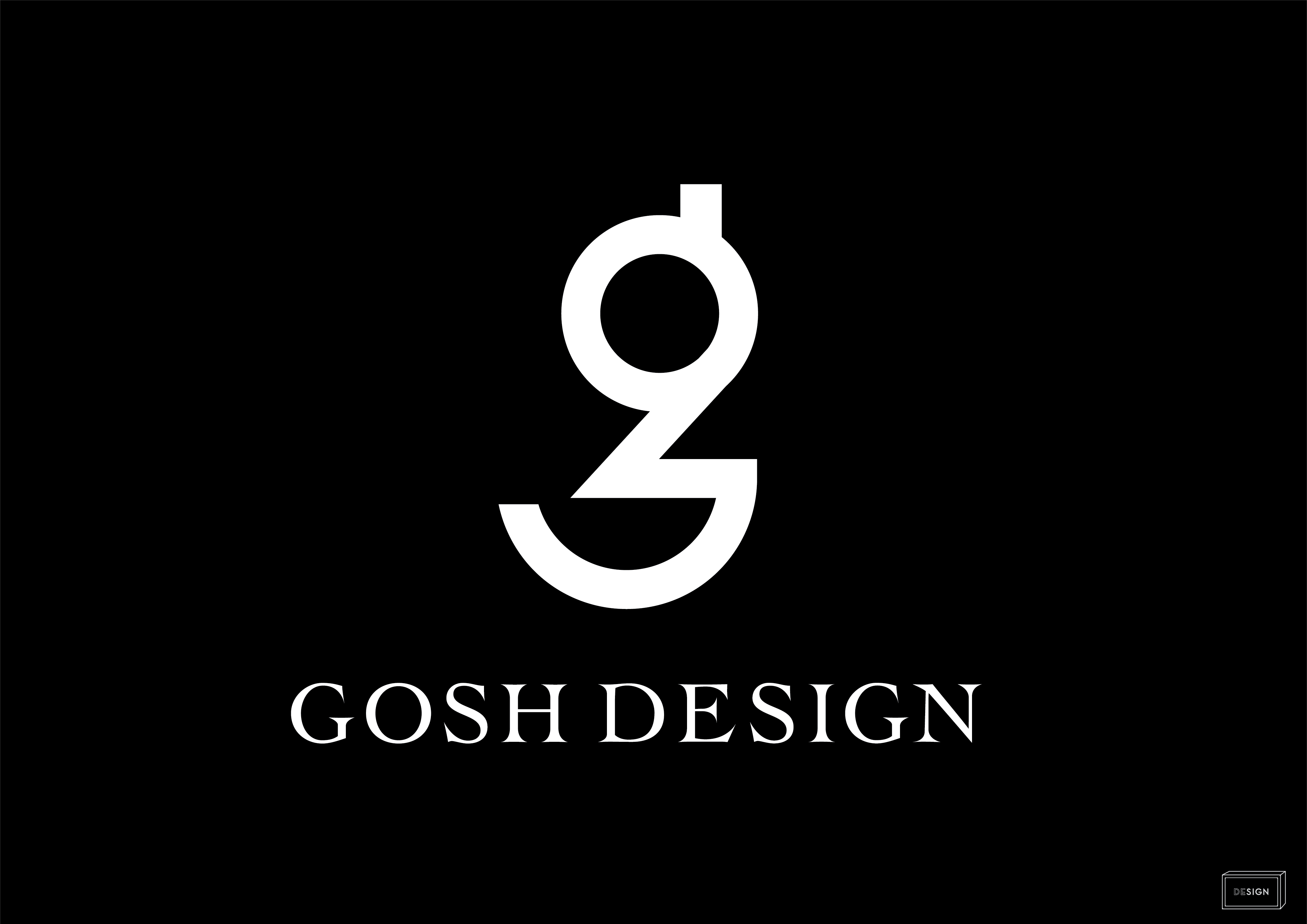
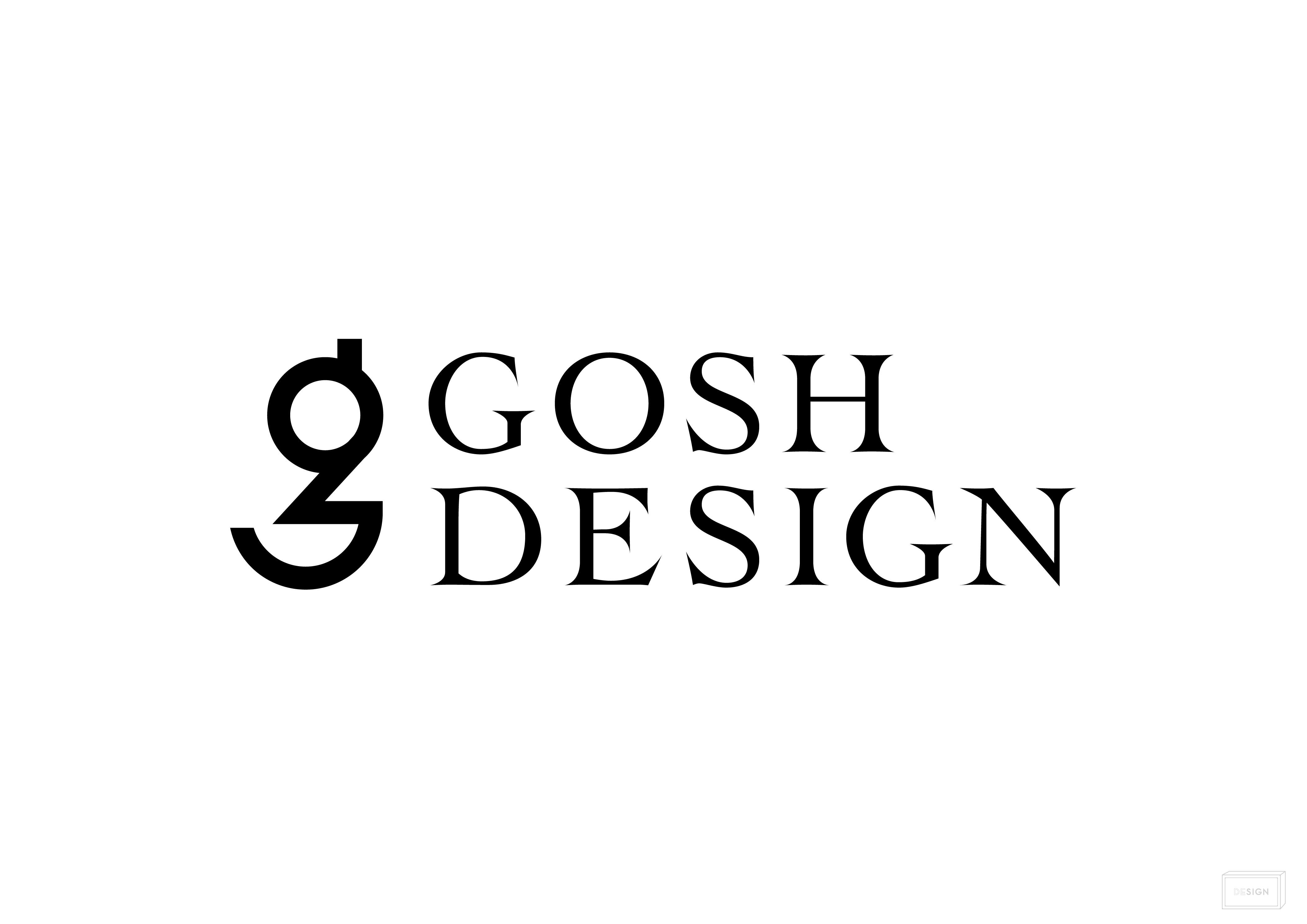
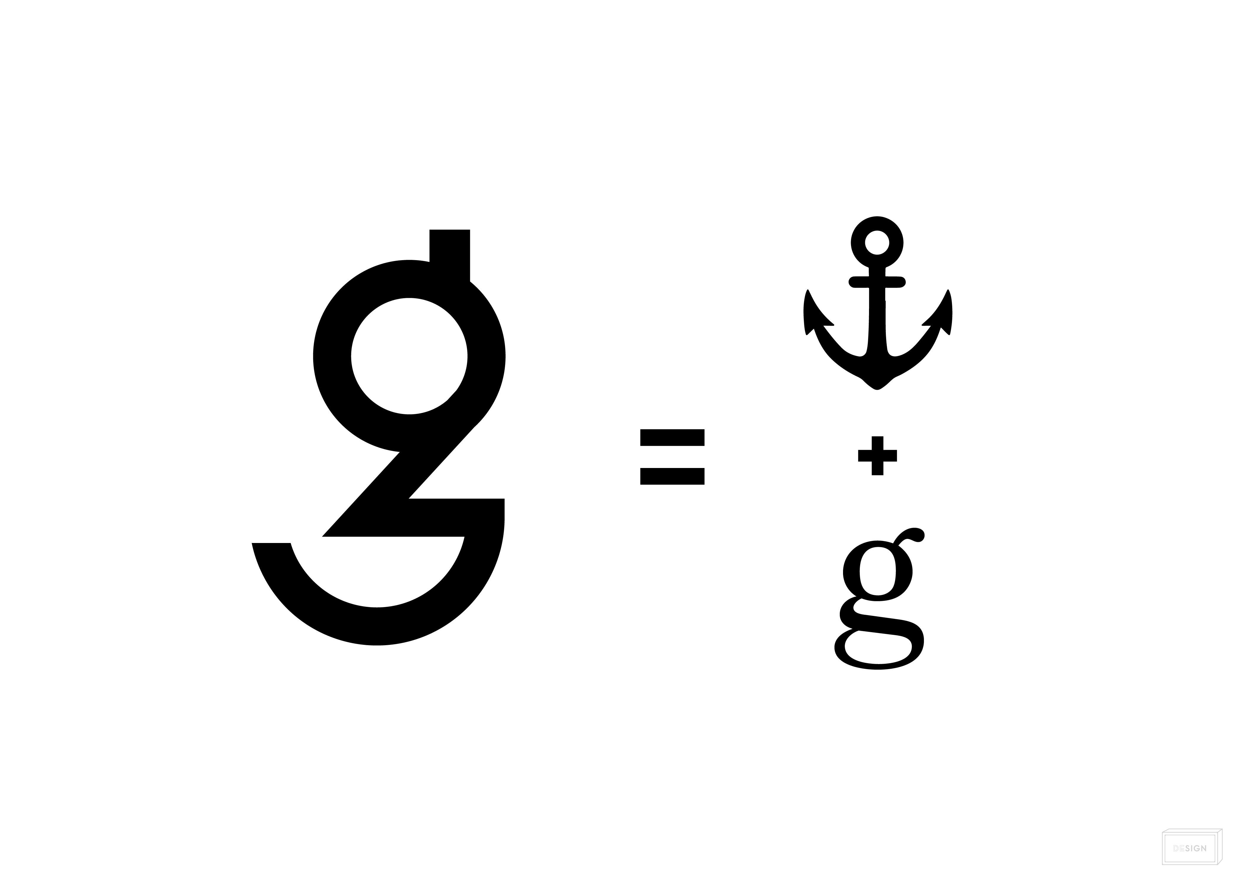
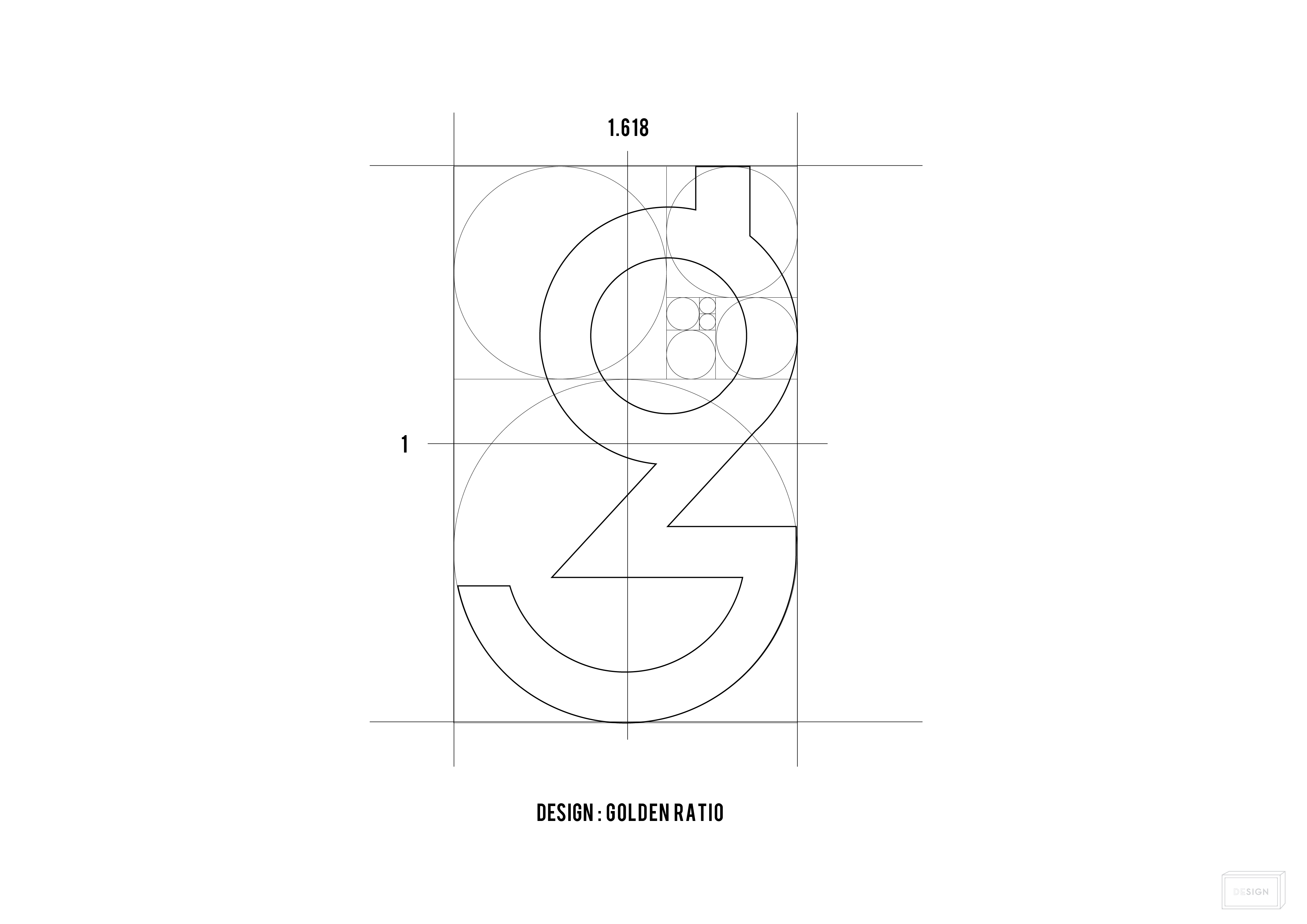
"GOSH" gives a surprise. Through design, we aim to be a person who can continue to surprise and impress our customers. To be able to. The letters are the old type in the 1900's. The letters used in letterpress printing for a long time have high visibility and readability. The corners are sharp and give a sharp impression. However, I designed it with a soft image that I wrote with somehow nostalgic ink. From such a thought, "I will not stop by the common sense of the world, I will not stop my adventure with my child's heart", I formed a symbol using the ship's guard "anchor" and Gosh's "g" that symbolize the strength to face difficulties. It was The symbol ratio is made up of the golden ratio. The golden ratio is a shape that is scientifically easy to remember in humans and has been used for historical buildings since ancient times, and has a shape ratio that is naturally liked by people.